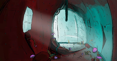
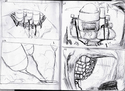
This is my initial research into some basic themes that I will explore and base my lair on.
Tuesday, 29 October 2013
Research and Thumbnail Exercise
This was produced during a research and thumbnail exercise in the Photoshop lesson, the practicing quick research for a character's lair. This first one was for a Gaelic Golem, I stuck to my usual thumbnail style with quick line work to show form.
This is research and thumbnails for a Candyland Huntsman, I tried to change the way I thumbnail for this one, using blocks instead of lines but felt it didn't work the same way and slowed me down and didn't show as much form.
This last one is for a Steampunk Explorer, I tried to combine using line work and blocks or colour to give a sense of depth in quick thumbnails and more shape to be able to work out what they are and see how colours go together.
Thursday, 24 October 2013
Tuesday, 22 October 2013
Monday, 21 October 2013
Friday, 18 October 2013
Thumbnail Sketches 132-137
These are some colour comps for my first scene, I wanted to create an alien landscape which I was finding difficult in my first one but I feel they came out better the more I produced with 137 being the best one.
Thumbnail Sketches 128-131
These are some colour comps for my second scene, I was trying to create a sense of scale for the machine at the focus of the scenes, I think 131 worked the best.
Thursday, 17 October 2013
Thumbnail Sketches 123-127
Following my quick sketches I created some colour studies to explore my idea to see what would work in the scene and what colours would work. I like 123 and 126 the most, I think i could change the colours and add in more plants to add to the alien feel of the moon.
This is a possible design for the machine in the caves, I am going to try some other colours with it and expanding it further to see what would work.
Thumbnail Sketches 111-122
Following the OGR I tried to come up with more designs for the machine in my book excerpt.
I also tried to design the Moon further, exploring the idea of the plants and the alien world.
Monday, 14 October 2013
Character Modelling Maya
This is my first character modelling in Maya of the two cartoon characters. It was much easier this time than when I first used it for the egg cups and the shapes came out better.
Friday, 11 October 2013
Thumbnail Sketches 107-110
I developed thumbnails further and carried on experimenting with colour and trying to use perspective to make the scene look more dynamic. I liked 108 and 110 the most.
Thumbnail Sketches 105-106 - Colour Studies
These are two quick colour studies trying to see what colour scheme would work in my scenes. This is a development of one of my key thumbnails and could lead onto one of the final scenes.
Thursday, 10 October 2013
Masters Studies
I looked at J. M. W. Turner's work and Casper David Friedrich's work and produced a digital painting of each to try and match up the colours and learn more about colours used and where they are on the spectrum. My first one was quite difficult due to the many different shades of colours used and this made it difficult to find certain ones. The second was easier but the colours are all slightly off from what they are supposed to be.
Wednesday, 9 October 2013
Tuesday, 8 October 2013
Thumbnail Sketches 96-99
These are some more thumbnail sketches I produced for one of my scenes taking place in a narrow passage. The style is very sketchy as I was just trying to get the ideas down and will work into them digitally.
Thumbnail Sketches 86-95
These are more thumbnail sketches to try and get more ideas for the power source in the caves, I felt sketches 88, 93, 94 and 95 worked best as they have the best sense of perspective and scale. These are ideas I will develop further using Photoshop and see how colour works in the scenes.
Thumbnail Sketches 85 Experimenting with Colour
This is my thumbnail sketch 85, I wanted to try producing a larger scale digital thumbnail sketch to see how some of my ideas worked on a larger scale, I liked the idea for it but found it looked a bit flat and needed more depth.
I tried experimenting with colour to see if this would give it more depth, which I felt worked better but was still flat and needed more foreground elements to separate the layers of the scene.
Subscribe to:
Comments (Atom)


